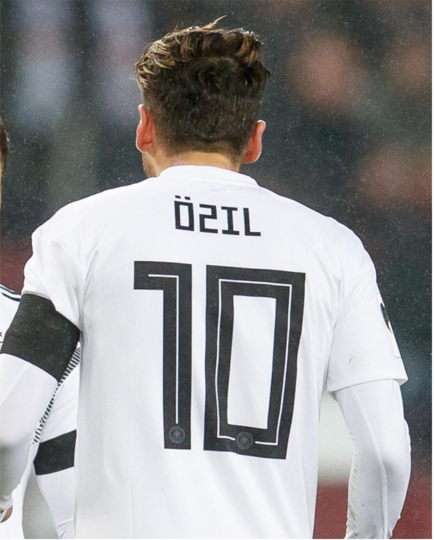
Who is Ö2IL?
The first duty of a text typeface is to be legible. The first duty of a display face is to attract attention. Once the attention has been grabbed, it helps if you can read what it says.
The sportswear company Adidas produced a font for the Russia 2018 World Cup, due to end this afternoon (Allez France!). This is it:
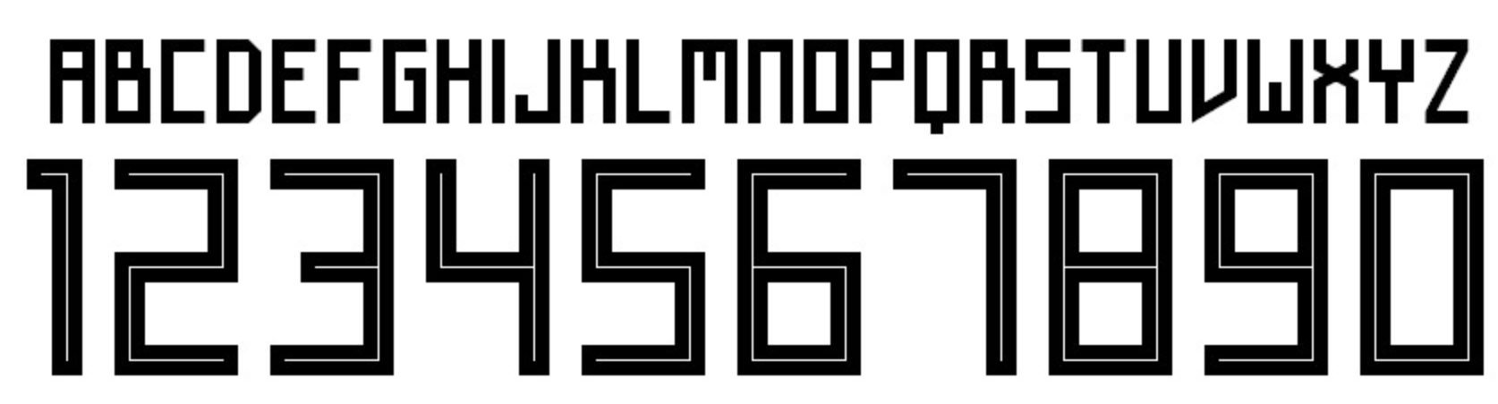
and I personally think it’s ugly and uninspired, unlike Dusha, the rather splendid font Russia chose for its World Cup graphics (and which was designed in Portugal).
The Adidas font is not particularly legible; the ‘H’, the ‘K’ and the ‘X’ are not easily distinguished. But look at the ‘2’ and the ‘Z’. They are different. But this proved too hard for the German team. One of their leading players Mesut Özil took to the field wearing the name Ö2IL, using a ‘2‘ instead of a ‘Z‘. Not surprisingly they got knocked out — what’s happened to the famed German attention to detail? (They also chose the ‘I’ from some other font).