The 100 Best Fonts: Display Misc
Click to enlarge.
DISPLAY MISC
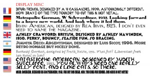
Bifur: French, designed by A M Cassandre, 1929. Astoundingly different. How brave of the type foundry to cut this in hot metal.
Metropolis: German, W Schwerdtner, 1932. Looking forward to a brave new world. And look where it led them.
Irvin: American, designed by Rea Irvin, 1923. I don’t even need to name the magazine.
Ashley Crawford: British, designed by Ashley Havinden, 1930. Perky, bouncy, seaside fun. So bracing.
Juanita Deco: Argentinian, designed by Luis Sicot, 1996. More retro homage but nicely done.
Remedy: German, designed by Frank Heine, 1992. What fun! Liberation from hot metal at last!
catastrophe: american, designed by judith sutcliffe, 1993. you always need one really silly font, and i like cats, so there.
Mojo: American, designed by Jim Parkinson, 1960. Far out and solid, man. Too cool for school. And made in hot metal!
There are three fonts I can’t show you because I don’t have them:
Paganini; Italian, designed by Alexandro Butti, 1928. A magnificent and grandiloquent Didot, possibly unreadable in small sizes.
Block: German, designed by H Hoffman, 1908. A Hunnish display face. Think Zeppelin. Big Bertha. Krups. Huge, heavy, yet vulnerable.
Hallo: German, designed by Wagner & Schmidt, 1914. Also known as Annonce Grotesk. I’ve chosen to show an extra bold extended lineal here as a substitute, because that’s what it is.
What about my least favourite fonts? That’s for another blog, and no, it won’t be including Comic Sans because it’s a brilliant font (if you’re lettering comic strips).


November 14th, 2016 at 17:38
[…] follies, fonts, food & other folderols « The 100 Best Fonts: Monospace to Scripts The 100 Best Fonts: Display Misc […]