The 100 Best Fonts: Display Lineal
Click to enlarge.
DISPLAY LINEAL
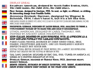
Broadway: American, designed by Morris Fuller Benton, 1929. The right name, the right style, the right place.
Flyer: German, designed by Linotype, 1955. So neat, so efficient, so striking.
Annonce Grotesk: German, designed by Wagner & Schmidt, 1914. Also known as Hallo. I don’t have this font, but it looks a little like this.
Plaza: British, designed by Letraset, 1975. Retro 1900s but my chosen type for architectural drawings.
Phosphor: German, designed by Jacob Erbar, 1930. Amazing to think a type foundry tooled up to make this in various sizes, then sold it successfully.
Lithos: American, designed by Carol Twombly, 1989. Inspired by ancient Greek inscriptions.
Stop: Italian, designed by Aldo Novarese, 1970. As arresting as a Stop sign.
Paris Flash: French, designed by Enric Crous-Vidal, 1953. Coarse, voluptuous and racy, like the French women I always hoped to meet but never did.
Festival Titling: British, designed by Philip Boydell, 1951. A modest, self-deprecating display face created for the Festival of Britain in 1951.
Gill Sans Shadow: British, designed by Eric Gill, 1930. Copied in America as Umbra, by R Hunter Middleton in 1932.
Othello: German, designed by Rudolf Koch, 1923. Another heavy, bouncy German.
Banco: French, designed by Roger Excoffon, 1951. Tabac, Alimentation, every other French shop façade in the 1960s used Banco.


November 14th, 2016 at 17:39
[…] fonts, food & other folderols « The 100 Best Fonts: Lineal Humanist to Font Suites The 100 Best Fonts: Display Lineal […]