from Harlech and London
fotoLibrarian
fotos, follies, fonts, food & other folderols

Archive for March, 2016

The Visitors’ Book

Monday, March 7th, 2016

We’ve just come back from a wonderful weekend with friends in Norfolk. Staying with friends is an unalloyed delight until the time comes to leave. Even if the delight was alloyed in any way, it will be as nothing to the gut-churning misery induced by mine host popping his head cheerily round the door in the midst of your packing and asking “Would you mind? It’s silly, I know, but it’s become a sort of tradition for us. Just a few words! Nothing special!” And there I stand, a pile of knickers in one hand, shaving stuff in the other, trying to transfer them into one hand so I can accept the proffered tastefully leather-bound Smythson (it’s only ever Smythson) visitors’ book.

I once spent three days in the French village of Hautrives, in the Drôme, long before the days of the internet. I was there doing a TV programme for the Discovery Channel about the world’s greatest folly, the Palais Idéal of the Facteur Cheval. If you like follies, even just a little, then a visit is mandatory. It is simply spectacular. I’ve seen more follies than most, and this is unquestionably Number One.

Palais Idéal

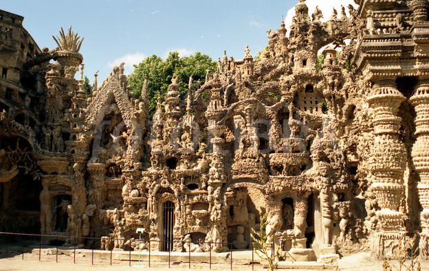
However television programmes take a long time to make, and this gave me plenty of thinking space, which in turn led to a revelation. People have puzzled over the postman Ferdinand Cheval’s motives and reasons for years — what drove him to create this masterpiece? The answer grew inside me over 72 hours, and finally it manifested itself: there is bugger all else to do in Hautrives. It is the most boring village in France, and that is saying a lot.

The lovely Carey-Ann Strelecki, the programme’s director, was busy all day on placement shots and only had time for me in the evening. When I wasn’t nursing a cheap beer I passed most of the day with the genial Pascal Cambrillat, then the Directeur of the Monument, comparing the cocoa mass of different chocolates. This was before the internet, remember. Nobody did anything.

While rootling around in Pascal’s office I discovered the Registre des Visiteurs, the Visitors’ Book (not by Smythson) for the Palais Idéal. The first entry was January 1st, 1905, before the Palais was anything like the size it became, and it was from a Jules Pangon, Docteur de Médecin de St. Vallier (Drôme), who wrote “De plus en plus enthousiasme pour la beauté et originalité incomparable de ce Palais Imaginaire” (More and more enthusiastic about the unmatched beauty and originality of this Dream Palace). Evidently this ran in the family, because Dr. Pangon was Pascal Cambrillat’s great-grandfather.

I leafed through the book. In the early days everyone who visited inscribed their name; later, with the rise of mass tourism, it was reserved for more distinguished visitors. In that first year there was a visitor from Monaco; a visitor from Lucca in Italy, one Isola Fortuna (Happy Island?); a traveller from Constantinople; the Marquis du Briand, and some strangely named people from London — a Mr J Chardonnet, S Woeskott and Chartrose Cloves (really?). There was a Walter Wrackmeyer from Germany and then some more realistic English names: F E Ward from Leatherhead, Mrs C F Olive from London, Dorothy and Peter Ridley from Chelmsford, Lewis MacPherson from Manchester — all in 1905.

Then the great and the good of France paraded through the pages. I fast-forwarded closer towards my era: Lawrence Durrell on May 6th 1961; Eric de Rothschild, Paris, on January 1st 1962; Ian and Judy Nairn, October 21st 1961, who wrote “Avec toute mon admiration pour ce travail immense.” (With all my admiration for this huge work).

Niki de Saint Phalle and Jean Tinguely visited from Paris on January 31st 1963. The visit inspired Saint Phalle to create the Giardino dei Tarocchi in Grossetto. In March 1965 Michael Gill the BBC film director was there, followed the succeeding year by novelist John Berger, hailing from Geneva, with the artist Lionel Miskin from Mevagissey.

Two final names were spotted: on May 22nd 1982 Susan Sontag wrote “Un rêve depuis vingt-cinq ans, enfin accompli,”  (Finally, after 25 years, a dream fulfilled) and five years before he died the idiosyncratic Austrian architect Friedensreich Hundertwasser commented on July 25th, 1995 “Un but dans ma vie.” (A goal in my life).

But then they didn’t have to spend three days there.

Share

Posted in Uncategorized | 3 Comments »

The Gulf War Memorial Inscription at the National Arboretum in Staffordshire

Tuesday, March 1st, 2016
There is a new war memorial at the National Arboretum in Staffordshire to the 47 gallant British servicemen killed in the first Gulf War.

I approve wholeheartedly, and would have supported the endeavour in some way had I known about it before.

But they have spoilt the ship for a ha’porth of tar.

When creating the inscription, they employed a translator to turn it into Latin, but they omitted to employ a typographer for a few pounds more. This is what they ended up with:

_88487777_de27-1

It’s set in Times New Roman. That could have been someone’s choice, until you see the quote marks, dashes, kerning — or lack of any of them.

Nobody chose Times New Roman. Someone has typed it out and handed it as it was, unthinkingly, to the manufacturer. It is appalling. It is cheap. It is nasty. It is thoughtless. It is undignified.

They’ve used the first font that opened on their machine. I’m astounded it wasn’t Arial. They have used typewriter quote marks instead of typographic quote marks, so they chose

 Screen Shot 2016-03-01 at 15.03.02
here set in Bulmer instead of Times. But why use quotation marks at all? What are they doing here? They are not required here; this is simply ungrammatical. This is potatoe’s.

And look at the dashes. They are not dashes; they are hyphen-minuses, only to be used by typewriters. Typographers have a choice of em dashes, en dashes, quotation dashes, hyphens, minuses and no doubt many more I haven’t heard of — a plethora of dash marks. They have different widths and different lengths for their different purposes. All ignored here, of course. The hyphen-minus will do — what more do you need?

I would have proposed something like this. Trajan is almost unbeatable for inscriptions, and a little letter spacing adds the simple majesty a war memorial requires. Forget the quotation marks, and note the completely differing dashes:

Trajan Inscription

I’m sure the last thing the organisers wanted was an undignified tribute in hackneyed old Times New Roman. But they didn’t know any better. And our soldiers deserved better.

When I presented my brother-in-law Andrew, a former British Ambassador, with my book The Encyclopaedia of Fonts, he responded “I never knew there was more than one.”

Andrew didn’t tell me whether he was on the Inscriptions Committee.

Share

Posted in Uncategorized | 7 Comments »

  • Last 5 Posts

    • Presentism
    • How big were the Beatles?
    • Anosmia
    • A Duty Of Care
    • 34 REASONS TO READ  THE MIRROR AND THE LIGHT by HILARY MANTEL
  • Pages

    • About Gwyn Headley
  • Archives

    • June 2020
    • May 2020
    • April 2020
    • March 2020
    • January 2020
    • November 2019
    • October 2019
    • September 2019
    • July 2019
    • February 2019
    • January 2019
    • December 2018
    • November 2018
    • October 2018
    • September 2018
    • July 2018
    • March 2018
    • December 2017
    • November 2017
    • October 2017
    • August 2017
    • July 2017
    • June 2017
    • May 2017
    • April 2017
    • February 2017
    • January 2017
    • December 2016
    • November 2016
    • October 2016
    • September 2016
    • August 2016
    • July 2016
    • June 2016
    • May 2016
    • April 2016
    • March 2016
    • February 2016
    • January 2016
    • December 2015
    • November 2015
    • September 2015
    • July 2015
    • June 2015
    • May 2015
    • February 2015
    • January 2015
    • December 2014
    • October 2014
    • August 2014
    • July 2014
    • June 2014
    • May 2014
    • April 2014
    • March 2014
    • January 2014
    • December 2013
    • November 2013
    • October 2013
    • September 2013
    • August 2013
    • July 2013
    • June 2013
    • April 2013
    • December 2012
    • November 2012
    • October 2012
    • August 2012
    • July 2012
    • June 2012
    • May 2012
    • April 2012
    • March 2012
    • January 2012
    • December 2011
    • November 2011
    • September 2011
    • July 2011
    • June 2011
    • May 2011
    • April 2011
    • February 2011
    • December 2010
    • November 2010
    • September 2010
    • August 2010
    • July 2010
    • June 2010
    • May 2010
    • April 2010
    • March 2010
    • February 2010
    • January 2010
    • December 2009
    • November 2009
    • September 2009
    • August 2009
    • July 2009
    • June 2009
    • May 2009
    • April 2009
    • March 2009
    • February 2009
    • January 2009
    • December 2008
    • October 2008
    • September 2008
    • August 2008
    • July 2008
    • June 2008
    • May 2008
    • April 2008
    • March 2008
    • January 2008
    • December 2007
    • November 2007
  • Categories

    • Uncategorized (349)

fotoLibrarian is proudly powered by WordPress
Entries (RSS) and Comments (RSS).