from Harlech and London
fotoLibrarian
fotos, follies, fonts, food & other folderols

Archive for November, 2016

« Previous Entries

Spam Invitations on OS X Calendar

Saturday, November 26th, 2016

Junk emails I can cope with (just about) but yesterday I had a Calendar invitation from crooks using the name Zang Si Xuan, as follows:

臧思轩 <1069020164184025178846050@8765456.tk>
$19.99 Ray-ban&Oakley Black Friday Deals Online.

When you get a Calendar invitation, it’s not an email. It comes through Apple’s iCloud, which is far more vulnerable to hackers than my Sinclair Spectrum. And Apple offers you just three responses: Maybe, Decline or Accept. DO NOT TOUCH THESE.

Clicking on any of these choices immediately tells Mr Zang and his accomplices that there’s a living entity at the other end ripe for plucking. Apple, please do something about this. Install an IGNORE button ASAP.

As soon as you click on any of the choices Apple gives you in Calendar, Mr Zang will flood your calendar with fake events, opportunities to buy his fake merchandise. It’s happened to many, many people in the past two weeks.

Before touching the invitation I went on line to see what others had done. The best solution seemed to be to create a new, empty Calendar, allocate the spam invitation to that, then delete the calendar.

Unfortunately the procedures recommended bore no resemblance to the Calendar app on my computer. So here’s what I did:

1. Open the Calendar app.
2. File> New Calendar> iCloud
3. Change new calendar name from (highlighted) Untitled to SPAM
4. Click on the unwanted invitation and select the new SPAM calendar on the drop-down menu in the top right of the invitation window
5. You will see a 1 appear in the bar next to the SPAM iCloud Calendar’s name
6. Highlight the SPAM calendar
7. Edit> Delete
8, The calendar will disappear. YOU WILL STILL see a notification of the spam invitation in the top bar. It will disappear within a minute.
9. That’s it.

I hope this helps.

Share

Posted in Uncategorized | 1 Comment »

Frequency Bands for The Most Common English Words

Friday, November 18th, 2016

How low can you go, or, Fun For Foreigners!

Band 8
the, a, an, this, that, I, you, he, she, him, he, that, which, what, who …

Band 7
man, woman, person, boy, girl, hand, eye, head, foot, blood, year, day …

Band 6
dog, horse, ship, machine, mile, assessment, army, career, stress, gas …

Band 5
surveillance, assimilation, tumult, penchant, paraphrase, admixture, conditional …

Band 4
astrological, egregious, insolent, Jungian, combative, bipartisan, cocksure …

Band 3
ebullition, merengue, amortizable, prelapsarian, contumacious, agglutinative …

Band 2
decanate, ennead, geogenic, sharawaggi, abactinal, absterge, satinize …

Band 1
abaptiston, abaxile, grithbreach, gurhofite, zarnich, zeagonite …

I stopped paying attention about the middle of Band 2.

Share

Posted in Uncategorized | Comments Off on Frequency Bands for The Most Common English Words

The 100 Best Fonts: Display Misc

Monday, November 14th, 2016

100 Best Fonts

Click to enlarge.

DISPLAY MISC
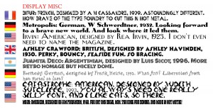
Bifur: French, designed by A M Cassandre, 1929. Astoundingly different. How brave of the type foundry to cut this in hot metal.
Metropolis: German, W Schwerdtner, 1932. Looking forward to a brave new world. And look where it led them.
Irvin: American, designed by Rea Irvin, 1923. I don’t even need to name the magazine.
Ashley Crawford: British, designed by Ashley Havinden, 1930. Perky, bouncy, seaside fun. So bracing.
Juanita Deco: Argentinian, designed by Luis Sicot, 1996. More retro homage but nicely done.
Remedy: German, designed by Frank Heine, 1992. What fun! Liberation from hot metal at last!
catastrophe: american, designed by judith sutcliffe, 1993. you always need one really silly font, and i like cats, so there.
Mojo: American, designed by Jim Parkinson, 1960. Far out and solid, man. Too cool for school. And made in hot metal!

There are three fonts I can’t show you because I don’t have them:
Paganini; Italian, designed by Alexandro Butti, 1928. A magnificent and grandiloquent Didot, possibly unreadable in small sizes.
Block: German, designed by H Hoffman, 1908. A Hunnish display face. Think Zeppelin. Big Bertha. Krups. Huge, heavy, yet vulnerable.
Hallo: German, designed by Wagner & Schmidt, 1914. Also known as Annonce Grotesk. I’ve chosen to show an extra bold extended lineal here as a substitute, because that’s what it is.

What about my least favourite fonts? That’s for another blog, and no, it won’t be including Comic Sans because it’s a brilliant font (if you’re lettering comic strips).

Share

Posted in Uncategorized | 1 Comment »

The 100 Best Fonts: Display Lineal

Monday, November 14th, 2016

100 Best Fonts

Click to enlarge.

DISPLAY LINEAL
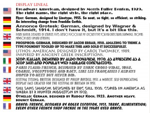
Broadway: American, designed by Morris Fuller Benton, 1929. The right name, the right style, the right place.
Flyer: German, designed by Linotype, 1955. So neat, so efficient, so striking.
Annonce Grotesk: German, designed by Wagner & Schmidt, 1914. Also known as Hallo. I don’t have this font, but it looks a little like this.
Plaza: British, designed by Letraset, 1975. Retro 1900s but my chosen type for architectural drawings.
Phosphor: German, designed by Jacob Erbar, 1930. Amazing to think a type foundry tooled up to make this in various sizes, then sold it successfully.
Lithos: American, designed by Carol Twombly, 1989. Inspired by ancient Greek inscriptions.
Stop: Italian, designed by Aldo Novarese, 1970. As arresting as a Stop sign.
Paris Flash: French, designed by Enric Crous-Vidal, 1953. Coarse, voluptuous and racy, like the French women I always hoped to meet but never did.
Festival Titling: British, designed by Philip Boydell, 1951. A modest, self-deprecating display face created for the Festival of Britain in 1951.
Gill Sans Shadow: British, designed by Eric Gill, 1930. Copied in America as Umbra, by R Hunter Middleton in 1932.
Othello: German, designed by Rudolf Koch, 1923. Another heavy, bouncy German.
Banco: French, designed by Roger Excoffon, 1951. Tabac, Alimentation, every other French shop façade in the 1960s used Banco.

Next: Display Misc

Share

Posted in Uncategorized | 1 Comment »

The 100 Best Fonts: Monospace to Scripts

Monday, November 14th, 2016

100 Best Fonts

Click to enlarge.

MONOSPACE
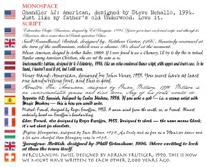
Chandler 42: American, designed by Steve Mehallo, 1994. Just like my father’s old Underwood. Love it.

SCRIPT FORMAL
Edwardian Script: American, designed by Ed Benguiat, 1994. You’ve got to have one formal script, and this is neater than Palace.
Snell Roundhand: British, designed by Matthew Carter, 1966. Massively overused, which was a shame. It’s dead at the moment.

SCRIPT MISC
Pelican: American, designed by Arthur Baker, 1989. If I were forced to use a Chancery, I’d try to slip this in instead.
Gneisenauette: Latvian, designed by G A Grinbergs, 1996. Like a condensed Banco script, with u/lc.

SCRIPT HANDWRITING
Viner Hand: American, designed by John Viner, 1995. You must have at least one handwriting font, and this is good.
Houston Pen: American, designed by Brian Willson, 1998. Willson is an individualistic genius and bird lover. Any of his handwriting fonts would do.

DISPLAY SCRIPT
Reporter #2: Spanish, designed by Carlos Winkow, 1938. If you were a god — i.e. a scamp artist with Magic Markers — this is how you would write.
Mistral: French, designed by Roger Excoffon, 1953. A warm wind from the south; so, so French.
Choc: French, designed by Roger Excoffon, 1955. Designed to shock — the name means Shock, not chocolate.
Pepita: Hungarian, designed by Imre Reiner, 1959. As lively and as fun as a Mexican dance.
Zaragoza: British, designed by Phill Grimshaw, 1996. More exciting to look at than the town itself.
Herculanum: Swiss, designed by Adrian Frutiger, 1990. This is how they wrote to each other 2,000 years ago.

Next: Display Lineal

Share

Posted in Uncategorized | 1 Comment »

The 100 Best Fonts: Lineal Humanist to Font Suites

Monday, November 14th, 2016

100 Best Fonts

Click to enlarge.

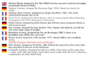
Grot 215: British, designed by Monotype, 1890. Ugly, unsophisticated and as homely as shepherd’s pie.
Akzidenz Grotesk: German, designed by Berthold, 1896. The ancestor of legible lineales and the inspiration for Helvetica.
Franklin Gothic: American, designed by Morris Fuller Benton, 1903. One of the great headline faces.
News Gothic: American, designed by Morris Fuller Benton, 1908. The man’s brilliance never let up.
Helvetica: Swiss, designed by Max Miedinger, 1957. The most popular font of all time. The only typeface to have a movie made about it.
Univers: Swiss, designed by Adrian Frutiger, 1957. A huge rival to Helvetica when it was introduced, but later fell behind.
Frutiger: Swiss, designed by Adrian Frutiger, 1976. Frutiger’s second attempt to overtake Helvetica. The choice of sophisticated typographers.

LINEAL GEOMETRIC
Futura: German, designed by Paul Renner, 1927. Cutting edge avant-garde. Thirty years ahead of its time.
Eurostile: Italian, designed by Aldo Novarese, 1962. Nothing more modern could be imagined. Stylish beyond dreams.

LINEAL HUMANIST
Johnston’s Railway Type: British, designed by Edward Johnston, 1918. The essence of London. One of the most influential typefaces.

Next: Monospace to Script

Share

Posted in Uncategorized | 1 Comment »

The 100 Best Fonts: Serif Misc to Lineal Grotesque

Monday, November 14th, 2016

100 Best Fonts

Click to enlarge.

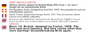
SERIF: MISCELLANEOUS
Albertus: German, designed by Berthold Wolpe, 1932. Funny — I always thought this was quintessentially British.
Friz Quadrata: Swiss, designed by Ernst Friz, 1965. Very popular for such an strange typeface.
Auriol: French, designed by Georges Auriol, 1901. Very art nouveau, almost Chinese in its dabbing calligraphy.
Engravure: British, designed by Monotype, 1920. I could have picked any of these lookalikes, so I chose the British version.

LINEAL GROTESQUE
Doric 12: British, designed by Caslon, 1830. The first sans serif typeface. Did they realise what they were starting? Groundbreaking Brits again.

Next: Lineal Grotesque to Lineal Humanist

Share

Posted in Uncategorized | 1 Comment »

The 100 Best Fonts: Serif Didot to Slab Serif

Monday, November 14th, 2016

100 Best Fonts

Click to enlarge.

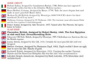
SERIF: DIDOT
Bodoni: Italian, designed by Giambattista Bodoni, 1788. Didot may have appeared fractionally earlier, but this is the definitive Modern typeface.
Bauer Bodoni: German, designed by Bauer, 1790. Take the most elegant font and make it more graceful? Bauer did it.
Modern No 20: British, designed by Monotype, 1850. Vogue’s choice for their masthead. Why say more?
Walbaum: German, designed by J E Walbaum, 1800. The warmest, most affectionate Didot.
Fenice: Italian, designed by Aldo Novarese, 1977. Named after The Phoenix, the opera house in Venice.

SLAB SERIF
Clarendon: British, designed by Robert Besley, 1845. The first Egyptian or slab serif font. Groundbreaking Brits.
Gloucester Old Style: British, designed by Monotype, 1905. Cheltenham was American; here was the British response.
Joanna: British, designed by Eric Gill, 1930. Certainly the most graceful slab serif ever designed.
Melior: German, designed by Hermann Zapf, 1952. Zapf couldn’t draw an ugly line to save his life. Hands of gold.
Rockwell: British, designed by Monotype, 1934. Copying the earlier German Stymie and the American Memphis, this was the one I was accustomed to.
Lubalin Graph: American, designed by Herb Lubalin, 1974. Monoline and architectural.

Next: Serif Misc to Lineal Grotesque

Share

Posted in Uncategorized | 1 Comment »

The 100 Best Fonts: Serif Transitional

Monday, November 14th, 2016

100 Best Fonts

Click to enlarge.

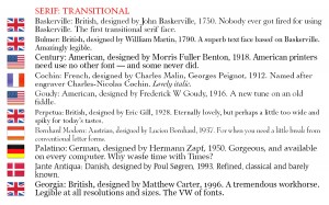
SERIF: TRANSITIONAL
Baskerville: British, designed by John Baskerville, 1750. Nobody ever got fired for using Baskerville. The first transitional serif face.
Bulmer: British, designed by Willliam Martin, 1790. A superb text face based on Baskerville. Amazingly legible.
Century: American, designed by Morris Fuller Benton, 1918. American printers need use no other font — and some never did.
Cochin: French, designed by Charles Malin, Georges Peignot, 1912. Named after engraver Charles-Nicolas Cochin. Lovely italic.
Goudy: American, designed by Frederick W Goudy, 1916. A new tune on an old fiddle.
Perpetua: British, designed by Eric Gill, 1928. Eternally lovely, but perhaps a little too wide and spiky for today’s tastes.
Bernhard Modern: Austrian, designed by Lucien Bernhard, 1937. When you need a little break from conventional letter forms.
Palatino: German, designed by Hermann Zapf, 1950. Gorgeous, and available on every computer. Why bother with Times?
Jante Antiqua: Danish, designed by Poul Søgren, 1993. Refined, classical and barely known.
Georgia: British, designed by Matthew Carter, 1996. A tremendous workhorse. Legible at all resolutions and sizes. The VW of fonts.

Next: Serif: Didot to Slab Serif

Share

Posted in Uncategorized | 1 Comment »

The 100 Best Fonts: Serif Oldstyle

Monday, November 14th, 2016

100 Best Fonts

Click to enlarge.

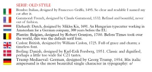
SERIF: OLD STYLE
Bembo: Italian, designed by Francesco Griffo, 1495. So clear and readable I named my cat after it.
Garamond: French, designed by Claude Garamond, 1532. Refined and beautiful.
Ehrhardt: Dutch, designed by Miklos Kis, 1691. An Hungarian typecutter working in Amsterdam for a German company, 300 years before the EU.
Plantin: Belgian, designed by Robert Granjon, 1700. Before Times took over the world, this was the default serif font.
Caslon: British, designed by William Caslon, 1725. Full of grace and charm.
Berling: Danish, designed by Karl-Erik Forsberg, 1951. Classic and dignified, perhaps a little too wide for C21 tastes.
Trump Mediaeval: German, designed by Georg Trump, 1954. The italic ampersand is the most beautiful single character in typography. &

Next: Serif Transitional

Share

Posted in Uncategorized | 1 Comment »

« Previous Entries
  • Last 5 Posts

    • Presentism
    • How big were the Beatles?
    • Anosmia
    • A Duty Of Care
    • 34 REASONS TO READ  THE MIRROR AND THE LIGHT by HILARY MANTEL
  • Pages

    • About Gwyn Headley
  • Archives

    • June 2020
    • May 2020
    • April 2020
    • March 2020
    • January 2020
    • November 2019
    • October 2019
    • September 2019
    • July 2019
    • February 2019
    • January 2019
    • December 2018
    • November 2018
    • October 2018
    • September 2018
    • July 2018
    • March 2018
    • December 2017
    • November 2017
    • October 2017
    • August 2017
    • July 2017
    • June 2017
    • May 2017
    • April 2017
    • February 2017
    • January 2017
    • December 2016
    • November 2016
    • October 2016
    • September 2016
    • August 2016
    • July 2016
    • June 2016
    • May 2016
    • April 2016
    • March 2016
    • February 2016
    • January 2016
    • December 2015
    • November 2015
    • September 2015
    • July 2015
    • June 2015
    • May 2015
    • February 2015
    • January 2015
    • December 2014
    • October 2014
    • August 2014
    • July 2014
    • June 2014
    • May 2014
    • April 2014
    • March 2014
    • January 2014
    • December 2013
    • November 2013
    • October 2013
    • September 2013
    • August 2013
    • July 2013
    • June 2013
    • April 2013
    • December 2012
    • November 2012
    • October 2012
    • August 2012
    • July 2012
    • June 2012
    • May 2012
    • April 2012
    • March 2012
    • January 2012
    • December 2011
    • November 2011
    • September 2011
    • July 2011
    • June 2011
    • May 2011
    • April 2011
    • February 2011
    • December 2010
    • November 2010
    • September 2010
    • August 2010
    • July 2010
    • June 2010
    • May 2010
    • April 2010
    • March 2010
    • February 2010
    • January 2010
    • December 2009
    • November 2009
    • September 2009
    • August 2009
    • July 2009
    • June 2009
    • May 2009
    • April 2009
    • March 2009
    • February 2009
    • January 2009
    • December 2008
    • October 2008
    • September 2008
    • August 2008
    • July 2008
    • June 2008
    • May 2008
    • April 2008
    • March 2008
    • January 2008
    • December 2007
    • November 2007
  • Categories

    • Uncategorized (349)

fotoLibrarian is proudly powered by WordPress
Entries (RSS) and Comments (RSS).